Guest Post by Liz Jamieson
 Some weeks ago I was reading Lynn's private Elite Members forum here at ClickNewz, and I came across one of Caroline's posts. Caroline sells GIMP tutorials (I've heard they're rather good).
Caroline was using WordPress and she wanted help with the layout of a sales page aimed at selling a special Halloween graphics package.
Doesn't The WordPress Visual Editor Make Things Easier?
As she tried to put her sales page together, no matter what she did, nothing would sit on the page exactly as she wanted it to.
I could tell from the layout of the sales page that she was using the Visual Editor and pointed out that in my opinion, the use of the Visual Editor in WordPress makes page layout more difficult, not less so - and I suggested that she dump it.
I also promised to show her how I might have built the same page using some graphics, the HTML Editor and some CSS...
So What's Wrong With The Visual Editor?
I think that using the Visual Editor doesn't help us to create persuasive pages. If the Visual Editor is all you know it's like wearing a webpage straitjacket. Here is my reasoning.
- Lack Of Consistency. The HTML editor in collaboration with CSS is more efficient for you. If you need to make a new style you do it in CSS. Some Visual Editors encourage you to change styles on the fly, so you have to do the same work every time you want to change a style on every post.
- Poor Code Quality. Google wants us to reduce code bloat. The visual editor is capable of producing a lot of extra code that is not needed especially when you re-work your posts again and again as you write them. If you use the HTML editor this problem is eliminated.
- Lack Of Confidence. Many people who use the Visual Editor do so because they believe it is a real alternative to learning HTML. But many of us need to know HTML to confidently handle affiliate links, to make minor changes to our websites and to handle some aspects of social media effectively.
- Getting Left Behind. If you only rely on the Visual Editor you can't make use of the latest technologies like CSS3. (This is demonstrated later in this post).
- What About Responsiveness?Responsive sites are all the rage now. Is it possible to maintain a responsive site if you use only the Visual Editor? Responsive sites rely heavily on the correct CSS classes being invoked. The Visual Editor does not encourage well behaved markup.
- A Non-Existent Problem The Visual Editor is limiting. It is after all trying to make it easy for you to use HTML and CSS by shielding you from HTML and CSS. But 99% of the time HTML and CSS are already easy to use. It's like trying to solve a problem that doesn't really exist. Yet we are brainwashed into thinking there is a real problem.
One of the things I persuade all my clients to do it dump the Visual Editor immediately. If you learn HTML you will not only have better pages, but generally, you'll find you're able to cope online a lot better than you did before. I hope to demonstrate with my sales page makeover that creating a page with HTML and CSS is not all that difficult.
OK so let's get on with the makeover.
Caroline's Original Sales Page
Caroline may well make changes to her sales page over time, but she has created a dummy copy of it so that she can refer to it, whatever happens to the original.

What Are The Changes I Set Out To Make?
When I started, I wanted to transform the original sales page (which you can see there on the right) in my own way. That does not mean that my suggested layout is right or wrong, it is just a vehicle for me demonstrate and to encourage others to take more control of their pages by dumping the Visual Editor. Quite how you will lay something out is up to you! But if I had a Halloween offer just like Caroline's, this is what I'd do.
- In my new version of the page, I want to create a sales page without a header from the main site. This is supposed to help reduce distraction by keeping the look and feel of the page dedicated to what you are selling and away from your site's main imagery (and links).
- I wanted to give the sales page a very definite Halloween look and feel.
- Also, due to the fact that people are now using mobile devices I wanted to try to make the sales page presented pretty well on iPads and iPhones (and hopefully on most Android devices too).
- I also realised that the layout of the page would necessarily be slightly less exciting than I might like if I also wanted to make it show reasonably well on mobile devices, with minimal effort and plugins.
- I wanted to reduce the number of colours used to a minimum, to give the page a coherent feel, train the visitor very quickly to find the headings on the page and draw attention to the main points.
- Lastly, I wanted to make use of the space the video occupied while and so add value while it was not being played. There are other things that I could do, but in the time allocated for this hypothetical project these are all I can fit in. I have paid no attention to the load time of the sales page for example, as it is not a real sales page.
My Version Of The Sales Page
I built my version of Caroline's Sales page on my website at DIYWebmastery. You can view my version here.

The Steps I Took To Build My Page
I Used WordPress With The News Genesis Child Theme
I used the News child theme (from Genesis) because that was what my site was already running. The News child theme also has a built in Landing Page template, which meant I didn't have to do any work to remove my sidebars and header. That part works out of the box!
I Made Sure To Choose A Responsive Theme
I only use responsive themes from Genesis nowadays, and recommend that you do too. This means the themes re-arrange themselves to look good on mobile devices.
I Stuck To A Minimum Number Of Colors
Apart from black and white, I have used blue, orange and yellow. I use a color picker tool to help me find colors that harmonize and in this case I wanted to see if the two main colors - blue and orange could be convincing on their own without too much else going on.
Using the HTML editor and CSS made sticking to the minimum colors very easy. Once the styles were defined, I just kept using them. This brought about consistency.
I usually use this free tool if I am starting from scratch Color Scheme Designer to help me with colors.
I Used Photoshop And Free Brushes
Photoshop is not cheap, BUT it is probably the best value for money of any software I have ever bought, period.
I used Photoshop to create the Halloween themed background. It took just a few minutes and required no skill whatsoever. I'll show you how I did it in this video :
I Used CSS Generation Websites
I got the CSS to draw this yellow testimonial bubble from a CSS Generation website.
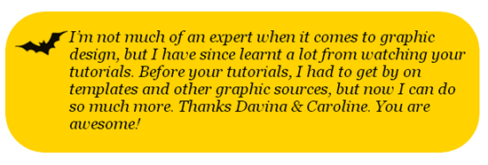
I like to do as much of the page as I can in CSS only, so as to avoid the use of background graphics where possible - I did Caroline's testimonials, like the one above, using CSS. I also use CSS for clickable buttons (like the Buy Now buttons). Here are some useful CSS Generation Websites.
- CSS Backgrounds - This one is good for generating the code for the backgrounds of DIVs
- CSS Buttons - I used this one to create the Buy Buttons on the sales page.
I Gave The Video A Thumbnail
The original sales page had a video on it, but when it was not playing it presented just as a black window. If you host your video files at YouTube or at Vimeo, (and probably elsewhere too), you can create covers for your videos (video thumbnails) so that the space looks attractive and continues to help sell your message even when the video is not actually playing.
I created this graveyard themed cover in Photoshop (using a brush!) and added it to Vimeo, where I am hosting the video file - see below.
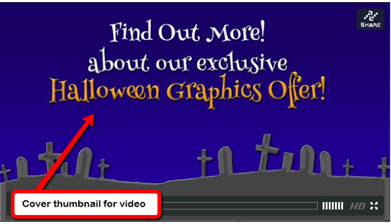
Although Vimeo isn't as good as YouTube for publicizing videos, they have some nice features in the PRO account. For example when the video has finished playing it can be made to go back to to the beginning, or even offer a clickable link. In the case of the Halloween sales page, I have had it return to the beginning of the video.
I Used Google Fonts
Web pages used to be limited to only those fonts that we could be sure a visitor would already have loaded onto their computers. This meant we were stuck with boring (but readable) fonts like Arial, Verdana and Times New Roman.
But with Google's Google Fonts service we can make our text a bit more exciting, so I used them for the graphic header image I drew in Photoshop, as well as the live text in sales page itself.
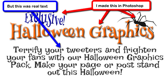
This enabled me to use a "scary" font as shown above as real text - not as an image. This makes the page a lot easier to change and to tweak.
I Didn't Use The Visual Editor At All
If I had I would have been doomed from the start. I still have to optimize the CSS, but in general, all I did was to decide on the font sizes, and then set up the CSS to reflect each part of the sales page. I have CSS for the headings, CSS for the bullet points and the lists, and so on.
The video shows you what I did :
A Final Word
I hope you enjoyed the post, and to those of you that don't know me, my name is Liz Jamieson and every video I produce has the sound of my dogs snoring in the background (in case you were wondering.)
I specialise in WordPress self-sufficiency and encouraging others to become more self-sufficient so that they don't have to find someone to help them for every tiny thing. If you're interested in learning more about what you can do with Genesis and WordPress, join the Genesis Club for lots of advice & help with your Genesis site.


I'm convinced. It's so much easier to just do things right rather than trying to take shortcuts. Liz breaks this down wonderfully. I learned a great deal from this post. Very helpful and I'll be looking for more info from Liz
Great to hear that Phil - thank you! Most of what we need is achieved by putting stuff into a number of differently styled divs. There is not much to it really. It probably just looks a bit scary. Happy Halloween!
Wow!!!! Very impressive, Liz. Love your version of the Halloween page, very cute and Halloweenie. Am taking note of the various resources mentioned in your post as well and will add them to my DIY design arsenal.
Thanks for sharing. Love what you did.
Kindly,
Missy
Thanks for taking the time to comment, Missy. I love researching tools online to help with web page layouts. Problem is most of these tools can't be used by those who won't venture outside the Visual Editor. Shame really as they miss out on all that extra stuff!
Well Liz! You've done it now. I see there is no going back - we are just going to have to learn this html. The page looks really good. One small thing to point out. Whilst we use Photoshop ourselves as well, you can do what Liz has done using Gimp also.
Caroline
Caroline - Thanks and glad to hear you are on track to crack it. Did you manage a look at the last video? It pretty much tells you what was done in HTML and CSS.
You are right about GIMP . . . I am just a complete fan of Photoshop - I tried to use GIMP but couldn't get on with it. However with your tutorials I'm sure it's really accessible for anyone. And of course it is infinitely cheaper than Photoshop.
Hey Liz - I actually have to grab a cup of tea, sit down for an hour and go through this post in detail. All will become clear I am sure.
Such an excellent post 🙂
Eren McKay was the Elite member who said don't use WordPress's built-in Visual Editot to me(actually texted it) also suggested that enabling the "Hello Dolly" shouldn't be done unless you just have a new sayin' everytime you go into your back end(my translation is does it really do anything and the answer is no.
After many free themes I have switched to the Genesis Framework and incorporaated a child theme into the GF. Am still a bit bummed regarding it's Footer and how hard(from my non-coder stand point)it is remove the built with Gxxxx and powered by xxxxxxx credits atthe bottom right of the Footer> Yes I have added the nessacary code into the footer and saved it, only to find out that doing so only allows me to a change a name.if I try to remove anything else it gives a "fatal error" and forced to either FTP, delete the change , then copy and paste the proper code , save it if nessacary or don the same using Cpanel.
Sounds like you have the correct code but maybe you made a typo when you were inserting it. Any mistake, no matter how small in functions.php will kill your site. You should start by pasting in the code as instructed here : http://www.studiopress.com/tutorials/customize-footer and then check that it works, and then one tiny bit at a time their footer values for your own.
That way you'll know where you are going wrong. If you do it all at once and make a mistake it is frustrating as you won't know where the mistake was.
Thanks for the information and have installed the "Simple Hooks " plug-in and the Genesis tutorial about footers was much more informative and helpfull then the one I "googled" and tried to use. I have been to your Genesis Site and while I can't afford a membership at the moment, have bookmarked it and prehaps later on I will be able to afford it
We'll be pleased to see you at some point in the future . But you sound like you are doing pretty well just the way you are. At least you are trying things and not giving up which is just the right attitude for this type of activity.
What an easy to follow instructional video. You make it look so simple and I will definitely think twice now about using the visual editor. I know little bits of html and css but this was very interesting. I particularly loved the snoring dog in the background, hilarious. Is it a bulldog as it sounded like one lol?
No he is not a bulldog. He (or should I say they), are much more handsome than that. They are three Cavalier King Charles Spaniels. Rio, Roma and Reina. And they are my constant companions in the office.
Wow! Liz- Great Halloween Sales page. It was very clear and clever. Loved the 'spooky' font.
Pamela
Yes those Google fonts are a life-saver. And for the moment they are the best solution out there if you want to get away from the boring old ones.
I can totally relate to people who are a bit afraid of HTML. I was a hard line "anti-coder" for many years before Liz got me to "see the light" and appreciate how just the most basic HTML can really take your website to the next level.
Lynn, you always bring the best people to our attention and I for one have to thank you for introducing me to Liz, her many talents and the Genesis Club - my clients, their sites and myself all thank you both for sharing your considerable talents.
Cheers,
Debra
Debra - you have been an ace student - embracing every idea and using it to build better and more profitable sites. Thank you for all the help you've given me.
Debra - I shall use you as the example for us to follow. html and CSS here I come!
Caroline
Especially as the graphics don't phase you Caroline. You really are all set.
thank you so much for these tips! I think Genesis is a parent template isn't it, and I actually think I have it, so you're saying load up genesis as the parent, load up a child theme and away you go... is that right??
Well, I just use Genesis because I like the framework and find it holds that line well enough between being easy enough to use, while not over-loading the front end with a button for absolutely everything.
Yes it is a parent and you can get child themes from the StudioPress site. However most of what I talked about in the post can be done with any theme.
I wonder if it's possible to turn off the visual editor completely! I'm reading thru this again just in cased I missed it. I find than many times I'll switch to the visual editor by mistake and the darn thing actually breaks the layout I've already done and adds all sorts of stupid code making me have to debug the thing.
Yes Danny - there is a way to do it. It is one of the first things I do with a new site. You go to the WordPress dashboard, and its on the user section. You can turn it off individually for each user on your site.
Cool! I'm going to go try it right now!
Brilliant! The users page on the backend is something you don't update very often. I hadn't realized that option was there. Just did it and I'm happy. Thanks!
Hahaha! I was always embarrassed to ask... So it turns out it NOT Russell snoring in the background in all your vids! Lol!
Liz,
What an impressive and detailed post. This post is almost a complete info product in its own right, complete with techniques, tutorials and videos - what an amazing job!
Bookmarking this as a reference guide - thank you.
Martin
Thank you Martin! Silly me - I will look at making some low cost info products. Just need to get the delivery mechanism right. I note your Twitter name is Camberley Town. Is that in the UK? I used to live in Camberley when I worked at Easams and the RAe as a graduate software engineer. Ah those were the days.
Hey, Liz, you didn't work at EASAMS did you! I did too!!! but I bet I was there waaaay before you!
I always use the Visual editor because I thought there were a lot of "no-nos" for WordPress and I assumed the Visual editor kept you from using them.
Have you come across Ultimate TinyMCE... does that make any difference to your advice NOT to use the visual editor?
Jennifer
First regarding Easams, I went to your blog and saw your photo there. You actually do look familiar!
There are no, no-nos from which the VE can save you.
Yes - I have come across Ultimate TinyMCE but not used it. I know many people love it. But you don't need it.
Jennifer - On your site, you need to take a look at it's indexing. And also the difference between the www version of the home page and the non-www version.
Great tips and pitch for breaking the "visual editor" reliance! It is hard to get away from that for non HTML or technical oriented minds, but is worth the effort if you are doing things yourself.
Liz, I quote:
"Jennifer - On your site, you need to take a look at it's indexing. And also the difference between the www version of the home page and the non-www version."
what is the actual difference and how do you decide please? I always ignore and just go for the main URL name but I don't know if my site is set up as www or non-www. How can we tell?
Thanks
Trish
Hi Trish
It depends on your hosting arrangements. Some hosts sort this out for you, some leave it up to you. For most people they can control which URL they want as their default by setting it inside their .htaccess file. You can decide therefore you want to be the www version, or the non-www version. If you go around the web you'll see people make different decisions. I don't think it matters which one you have as long as you don't have both.
Google and other search engines see http://www.example.com and example.com as two completely different web sites. So if you don't set things up properly, you can end up with two pages in the index with the same content. Duplicate content has always been a no-no.
You can speak to your host about it and get their help. But in general you are trying to make sure that if a person types http://www.example.com or example.com or http://www.example.com/ or whatever .... that they end up at the same URL.
You can do a quick check on your own site - for example if you type genesisclub.co or http://www.genesisclub.co/ you will end up at http://www.genesisclub.co. I.e I have tried on my site to make sure that whichever variation you type, you get the same page. Your site i set up to whichever one it goes to consistently. And the goal it to set it up to automatically and consistently redirect to either the www or the non-www.
Hi Trish
It depends on your hosting arrangements. Some hosts sort this out for you, some leave it up to you. For most people they can control which URL they want as their default by setting it inside their .htaccess file. You can decide therefore you want to be the www version, or the non-www version. If you go around the web you'll see people make different decisions. I don't think it matters which one you have as long as you don't have both.
Google and other search engines see http://www.example.com and example.com as two completely different web sites. So if you don't set things up properly, you can end up with two pages in the index with the same content. Duplicate content has always been a no-no.
You can speak to your host about it and get their help. But in general you are trying to make sure that if a person types http://www.example.com or example.com or http://www.example.com/ or whatever .... that they end up at the same URL.
You can do a quick check on your own site - for example if you type genesisclub.co with or without the www, you will end up at the URL with the WWW. I.e I have tried on my site to make sure that whichever variation you type, you get the same page.
Your site will be set up to whichever one it goes to consistently. Just try typing into the address bar, the URL variations for your own site and see where you end up. The goal is to set it up to automatically and consistently redirect to either the www or the non-www.
Wonderful post, quite easy to follow, its simple and I will definitely think twice now about using the visual editor. I know little bits of html and css but this was very interesting, bookmarking it, good post, thank sfor sharing.
HELP! I thought the 2 were interchangeable - www and not! I've no idea how to access the one that I'm that I'm not currently working on!
I was also going to ask .... I thought WordPress automatically put the headers and footers on every page ... I don't see where you say not to put it on Caroline's Halloween one.
And.... where do you save the css code ... I thought it was something one wrote sort of as a pre-ample to the page and then used as shortcodes within the page... but wordpress has a css.php file. do you go in there?
I guess I need a session with you!
Jennifer - this is why I say dump the VE. It makes you think that WordPress is easier than it is - all around. I know that sounds daft, but I have seen it loads of times.
I think you need to get to grips with what the structure of the site actually is - no rose tinted specs - and then, and only then you can decide to use tinymce or anything else you want to do, as then you do it in knowledge.
About the footers and headers - yes - normally WordPress will include them everywhere. There are a number of ways of getting rid of them for sales pages. One of the easiest ways is to invest in a good theme - a lot of us here use Genesis - and many of their newer child themes include a landing page template. So you just select it and voila, no headers/footers.
That belief you have about CSS and shortcodes is incorrect and now that you have told me you like Ultimate TinyMCE (without learning what it is trying to do on your behalf), I get why .... it has probably contributed to the clouding of the real picture.
You're right, Liz... all a pretty cloudy picture!
Guess it's time to blow away the cobwebs and bask in the full light of day.
Thanks for your advice
Hi, Liz! You wrote a great article. To be completely honest, you have opened my eyes regarding WordPress Visual Editor. I'll try your "tricks" as soon as I can. Thanks for sharing!
Lynn has a link up there at the end of the post before the comments to Liz's Genesis Club, where you have access to all types of videos and a private forum to ask questions in. If anyone is worried about cutting the cord to the Visual Editor - I say do it - and use Lynn's link to make Genesis Club your safety net!
Great post Liz! Everything is smooth and easy to follow.. As always, you never fail your readers! keep it up!
Oh Liz - I'm on my third read. I just love what you have done with this page and you are right - I do feel like I'm in a straight-jacket, not being able to put things where I want.
I'm not a web designer, but I don know what I want and what I would like to do.
I think this could be a Christmas project (but there are so many things in that pile already) 😛
Caroline
We are all web designers now, so why not get started with a simple Christmas backdrop. I have to work on a sales page of my own this weekend, so I am in the same boat. Start with a simple idea, and a couple of main colours and you're almost there.
Please let us see what you do.
Hello Liz
What a great blog post. Actually one of the best I have read in a while.
I loved how easily you transformed that Halloween salespage.
I also agree with your about using the WordPress visual editor. Sometimes it can create more problems that what it's worth.
Thanks for sharing the tools you used. I learnt some new ones that will definitely come in handy such as the Google Fonts tool, and the CSS button generator.
Thank you. I think that is the key - how easily it was done, the new sales page. Not saying it was the best sales page but I was showing you could practically change it at will. Please share the post with others. I'd love this to become a link magnet for Lynn. She does so much to help us all.
I too find it very difficult to create a sales page using WordPress visual editor. I use Live writer even for publishing my post.
I think Thesis is the best theme where you can create great quality sales pages. The tips you have provided to create your sales page are excellent. I bookmarked it & use it in future.
Thanks
Hi Liz,
Great post!! I agree totally and HATE the visual editor. One of the only negatives I have with WordPress. I bit the bullet and learned how to use HTML and CSS. I recently taught a WordPress class for an adult school in a neighboring county. I spent some of the last class trying to de-mystify HTML and CSS for my students. It is so important to learn at least a few of the main tags and codes so you can make basic changes.
Thank you!
Evelyn
Hi Liz - thanks for letting me know about this guest post of yours.
The Visual editor in WP can be a real drama queen to work with.
Recently I've been going over a few of my sites to add in Microdata/schema.org markup but WP consistently strips out the span elements when switching from the HTML editor to the Visual editor - in the end I ended up switching to another editor.
I love the term "drama queen" for the VE. It is strangely accurate. Oh well, microdata type markup is another fabulous reason to avoid it. That's a very useful post you link to there in your comment by the way. Thanks for that.
Liz, thanks so much for this incredibly detailed post. You are a natural teacher!
I have to take some time to really go through your videos. I absolutely hate the visual editor. It's so limiting. I've learned a little bit of html over time, but not enough to really make things interesting. I tried the Ultimate Tiny MCE plugin, which gives more options. Actually, one of the things I did like about that plugin is that you can see what the html is for different styles. I always end up going into the html anyway to fix something.
The downside of having to work just with the html editor in WordPress is that I have to keep "previewing" the page to see what it's going to look like. Is there a better way to preview as you go?
And do you keep some kind of "cheat sheet" or swipe file for styles and code that you use frequently?
- Sharyn
Hi Sharyn
Thanks for your comments. No don't really see having to preview as a downside. I wrote a post about it : http://www.diywebmastery.com/2830/use-the-preview-facility-to-view-your-html-post
I don't have a cheat sheet it's in my head, but I'll put one together.
Liz
Oooooh - I'd love a cheatsheet.
You could even put together a product, if you haven't already, that has example html/css for different styling or layouts. For example, if someone just wants to show a portion of text that's highlighted yellow, what would the code be. Or, if they want to insert a table with 3 columns, give the code with indicators for where to put text. Simple stuff for people that haven't been able to make the transition away from the Visual Editor, but who want to be able to do a little bit fancier formatting without getting too complicated.
That might convert a few die-hard VE people for you!
Hi Liz,
Awesome and amazing info you have shared here. Thank you and all your tips will go a long for me. Anyway I am not good at HTML and CSS but I will give try soon.
I have always had trouble with Visual Editor not letting me do what I know I could do in HTML. I am glad to know it wasn't me being silly. I use to do a lot of HTML coding back in the early days of the WWW so I am more comfortable coding that way.
Excellent tutorial I am glad I took the time to visit.
Thanks Bill for taking the time to comment. I think there are two tribes - those that don't and those that do. Glad to hear you are in the latter!
Wow, Liz! I'm a bit late getting here, but this is quite a kick-fanny tutorial. I learned quite a few new things I'm going to use and I've been coding websites for 14 years. I agree that the WP Visual Editor is often more of an obstacle than it's worth. I may just abandon it, too. I would very much recommend that any serious marketers here learn the basics of HTML coding. It's really not as so hard once you have a working knowledge of it, since most of time you're just copying and moving around existing code. I recommend the free W3Schools.com tutes online and Elizabeth Castro's Visual Quickstart Guides.
Thanks Liz and Lynn.
Go on abandon it! Thank you for your feedback Wade! I had to laugh at your expression "kick-fanny" which I'd never heard before . . . in the UK . . . LOL.
Liz, have you used the new plugin InstaBuilder that you can use with any theme for building sales, squeeze, thankyou, and download pages?
It's kind of a plugin vs. theme issue, in that using a theme like Genesis or Optimize Press restricts you, while a plugin allows you to use it and change out your theme any time you wish.
What are your thoughts on plugin vs. theme for building sales pages, etc.? And would your advice offered here apply to using that plugin to build sales pages, too?
Robin Carlisle
Hi Robin
I have not used Instabuilder. It may be a good plugin, but what I hoped to show here was that you did not need a special sales page plugin. It was just done with HTML, CSS and a theme that allowed me to create (at the click of a button) a blank page with no header, sidebars or footers. Which is all you need to make a sales page.
Best
Liz
There are a lot of landing page products available. They all do different things for different amounts of money. Doing it manually, yourself will not replace these products as they often do a little more than just help you make a sales page or a squeeze page, but if all you want is a simple sales page manual methods work.
The ONLY purpose of a sales page is to sell.
The first rule (maybe the only rule) of sales is K.I.S.S - "keep it simple stupid".
I find a lot of people are so afraid of sales they look for something to help them make a sales page when all they need to is follow the rule:
1 ID a problem - building effective sales pages
2 ID a solution - manual vs plugin
3 ID where to buy a solution - Genesis Club - creating more Geniuses or Genii than Apple!
Follow that formula on a simple sales page using Liz's GC tips there's no reason to buy or slow down your site with yet another plugin - and yes I did just say that - y'all know I'm a self confessed recovering Plugin AND VisEditor tart right? 🙂