You can see that my follow-up post about it already has 137 comments (and growing):
Are You Disappointed?
One of the major concerns that kept coming up in the comments was my proposed use of "slimy pop-ups", or my intentions with the Popup Domination product.
I have some before and after examples to show you today, after playing around with the program a bit. I think you'll be impressed at how I'm using the product, and the end result in these live examples...
New In-Line Subscription Form Below Blog Posts
See the image in the top right corner? That's a screenshot of my new subscription form here on ClickNewz, which you'll find at the end of each blog post. Scroll down to the end of this post and you can see it live.
MUCH better than the drab grey (practically invisible) subscription form that was there before, don't you agree? 😀
That was example #1... (so far, no pop-ups!)
Fresh New Landing Page For My Upcoming Book
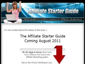
I wasn't happy with the way the web page looked for my upcoming book. I had a standard Aweber opt-in form on the page, but it didn't align correctly in some browsers (*cough* IE *cough*).
It was also very plain... especially compared to the new page I designed using Popup Domination. Again, no pop-ups used - just the graphics.
On the left you see the original site. On the right you see the new landing page. You can click either one to view the actual pages in a new browser window:
That was example #2... (and still no pop-ups!)
* * * * * * * * * *
Another Landing Page Converted...
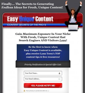
Next, I decided to work on the landing page for www.EasyUniqueContent.com since this is the next product I am coming out with. I'll give you another before & after set so you can see the difference:
If you click through you can actually visit each of those pages. The "before" page is a bit jacked now as I updated my opt-in form to Aweber's new code and it messed up my formatting. Not that there was much to mess up there anyway. 😛
I would love to hear your thoughts on all three of these before & after examples with new on-page forms. Do they appeal to you more? Would you be more likely to opt-in to either of the new pages vs their original pages?
Your feedback is welcome, as always.
I have a 4th (new) subscription form going in at the top of the ClickNewz Forum, though it's not live yet. But it may be by the time you read this...
This package was a steal at $47 for the PSD & CSS files alone, as well as the script to create different layouts and color variations. Of course, you can still get it for only $37, which is an even better deal than I got.
I hope this helps you understand why I could care less about the sales copy, and grabbed this package at the sales price without a second thought - and without any actual intention of creating "pop-ups".
Best,
p.s. You can still get the discount I originally shared, which is a $37 download instead of the usual $77. All you have to do is go to the sales page, then close the window without ordering. You will be given a chance to purchase it for $37.
This time I will warn you: there are typical "Internet Marketing" tactics, sales copy & one-time-offers involved. 🙂 If you don't care and you want to create cool lightboxes or super-nice subscription forms, grab it while you can!


Very nice, Lynn. And yes, yes, yes I would be more likely to Opt-In ... and DID. As always great input with detailed explanations and visuals. I think most followers would trust that if you bought or promoted something that seemed a bit "controversial" you would have a good reason for it ... and you did!
Definitely way better. The forms stand out, are clear and look good. But most importantly - they stand out.
A good product at a good price, despite the claimed craptastic sales copy and IM pitches. Thanks for sharing your before and after examples on both counts.
Cheers,
Missy
Great job with these, Lynn. I think you'll see your conversion numbers boost way up, and they're probably already really good.
On the Easy Unique Content, on my small laptop screen the opt-in box is below the fold, so you might consider either bumping it up about 60 pixels or adding in a large down-arrow or something to force us down the page. There was a lot of reading and I wasn't sure where it was really going until I scrolled to find the optin.
LOVE that corner opt-in for the general content pages. That's killer. And the opt-in for Affiliate Starter Guide is SO much better. You may want to increase the size of the headline on that a bit (in the Advanced Settings) to give it more impact. 🙂
Thank you for the tips & feedback!
Much appreciated 😀
My pleasure! You have given so much for so long... I feel it's like throwing a penny back into an acre of diamonds. 🙂
Just goes to show that many people are TOO quick to judgement. heh heh
Those are some pretty slick new optin forms you've engineered, Lynn. It looks really great.
Now ... IF I only understood CSS and html better. LOL
Rick Wilson aka CorpRebel 😎
I was rusty myself 😛 LOL
Hi, Lynn. I really like the revamped forms. They look much better. I do have a couple of questions for you since you have now used the script:
1. When you look at their sales page, it says that you get a "personal" license. Normally, that means you can use it on only your own sites. However, when you go to purchase it, you are taken to another screen that says for another $37 you can use it on multiple sites. I emailed support twice asking for clarification because $47 (or $37) would be a lot if you can only use it on one of your sites. No one will respond to my question. 🙁 Do you happen to know whether you can use it on multiple sites without paying another $37?
2. Do you have to have Photoshop to use the product?
Thanks for any info!
Charity
You don't have to use Photoshop, no. I do have it which was a plus but didn't end up using it (yet). If you were going to use the program to create a pop-up, it only creates one - and on the server where you install it. I used the program to generate different templates (one at a time), then copied the code and CSS files and uploaded what I needed to different directories - because all of those sites are hosted on the same HostGator account. Not that it would matter, just clarifying. But if you *were* using it to create lightboxes or pop-ups, it would only create one active lightbox. My copy anyway ($47).
The most impressive improvement is the landing page for your book. It's seamless appearance is a huge improvement.
Question: is the opt in box at the bottom of your post a subscription to your posts or to an autoresponder? I have a subscription to posts integrated with Feedburner, but it looks terrible. I'd love to jazz it up.
Thanks for the follow-up.
The opt-in box here on ClickNewz, both below posts and in the right sidebar, subscribes you to the weekly digest of blog posts. It comes out on Monday morning around 8am Eastern time.
I use FeedBurner and it integrates with Aweber, which is what I use to send the "blog broadcast".
I love the revamped looks on the landing pages, especially the one for the Affiliate Starter Guide. They are sleeker and definitely more modern looking - a great way to stand out from what is the current style norm. I also really like the opt in at the end of every blog post - and I don't find it annoying at all.
I must be incredibly hard to please. I still don't like them and would still click close on them without reading a thing. It is how they "feel" and my gut reaction to them. It is too canned, too much fill in the blank, impersonal and I just don't care for that myself.
I do like the honest & frank discussion. THAT is refreshing!
Ginger
Thank you for the feedback, Ginger! So you *did* like the original subscription forms in each example - or didn't care for those either?
Way to go Lynn and thanks for sharing the examples. I think we tend to climb up on soap boxes but no one should jump to conclusions or judge our businesses. I too use it to pretty up my opt-in forms and for jazz things up vs. slamming folks into pop-up limbo.
Personally, I don't have anything against using a popup once. Heck, CNN, and all the big websites use popups as well. So I don't see anything sleazy with it. But they do to tend to get abused which why folks get so hot about this subject.
I would love to hear your results if your opt-in rates went up with these new changes. 🙂
I love the new form under the post. I notice you went with email only and dropped the name portion...are you testing?
Yes 🙂 Less friction is supposed to increase conversion. Something I was interested in testing after reading http://www.listbuildingforblogs.com by Phil Hollows...
Lynn, how did you create the in-line subscription form below your post? I have the product but wasn't aware there was a way to do that. Any advice would be great so I could get one on our site, without having the popup like you said. Thanks!
I use the AddSig wordpress plugin.
I was always meaning to ask you about what you were using to add those sigs. Was always forgetting to ask. LOL
Rick Wilson aka CorpRebel 😎
Hi Lynn,
I like how you used this! I didn't realize you could do other things besides the popup.
Question - with AWeber popups, you can do it so a visitor only sees the popup once. So he/she doesn't see it everytime she visits the site, which is nice. Is this an option with this popup?
FYI - I have *cough* IE *cough* and your new form for Easy Unique Content is not centered and is funky looking.
Peggy
LOL I made changes to it and didn't check it again, so thank you! And yes that is an option with popup domination - you have a lot of settings actually.
I like the newer version of all them better, and would be more likely to sign up if I landed on them cold.
Like most tools, you can use Popup Domination wisely or in less "acceptable" ways. It's not the tool that's the problem - it's the way people implement it.
Can't you do all of this with Aweber? I still do not get PopUp Domination... it's just a re-done version of a functionality that is already available to anyone using Aweber! Or am I missing out on something completely? I use Aweber and have a 'pop up' and it 'coverts' very well... all of that is true. But why do I need to buy another software that does exactly what Aweber does?
Sorry Lynn, maybe you have answered these concerns before...
And good luck with the product launch! 🙂
Popup Domination has different designs than Awebers. That's why Lynn bought it. So she could adapt their optin design to her sites.
And it's alot easier for us non-coders, like myself, to add popovers/lightboxes.
ALSO... not everyone uses Aweber and has the ability to add lightboxes/popovers with their AR service. 😉
Rick Wilson aka CorpRebel 😎
All of my original subscription forms (the "before" pages) were created with Aweber. I wanted something a little slicker, and more professional looking. While Aweber offers A LOT of options, I really like the graphics that come with Popup Domination.
Hi, Lynn ~
You are so creative! Your new opt forms look really slick! I followed your link on Facebook to this post. What is strange is that I did not see the first form you referred to at the end of the post. Very strange... so I refreshed the page and then it was there? Just thought I would mention it. I am on a PC using FF 4.0.1.
Thanks for this "behind the scenes" look at how you are using Popup Domination. You rock! 🙂
I had to refresh my browser to see it at first as well. That's because it's cached in our browsers. 😉 If you refresh and still can't see it, try holding down the SHIFT key while clicking Refresh to refresh the page from the server...
I was just about to comment on still seeing the old form on the post -- thanks to Janis for pointing out the fix for this!
But I do agree that the new versions of each are much more appealing. I especially like the horizontal layout on your book page.
Hi Lynn
Thanks for the recommendation - it fitted with your previous advice of can this help me right now - and I need help with opt-ins from my niche blog.
Really easy to use - I've got nowhere with my Aweber account previously and this was up and running 10 minutes out of the box. Just wondered how it copes with pop up blockers?
Regards
David
Hi David,
I'm not sure since I'm not using pop-ups on any of my sites...
Whoops - I think I just sinned!
Oh well lets see if I get any sign ups - my problem is that the usual Aweber form doesn't give me enough space to sell the benefits of my give away, but the pop up format is perfect - I don't want to be spammy or slimy - honest!
Self flagellation over!
Did they change the offer in response to your post or did you always have to pay more for more than one site? I went to close the window like you said and got the 37 dollar offer but one of the OTO was to allow you to use it on more than one site. I didn't see you mention it and missed that on the sales page the first time. Or did I need to select the more than one site option and THEN try to close the page? If that's the case, looks like I'll be refunding and repurchasing.
Jeff
Hi Jeff,
No, the offer is still the same. See my comment here for clarification: http://www.clicknewz.com/2869/calm-the-controversy/comment-page-1/#comment-911332 🙂
So the WP plugin will allow me to create sign-up forms(not popups)on more than one site?
I used the standalone version as I mentioned in that comment above. I installed the standalone version, created close to what I wanted, went to View Source and copied the code - then the associated CSS file, and finished them off in Dreamweaver.
Sorry, Lynn. Didn't see where you mentioned the stand-alone version anywhere. I have some studying to do because I wasn't planning on using DW.
I did to make it easier. You could use any HTML editor - or just edit code in notepad, or any text editor.
Hi Lynn,
I think they look great and are quite an improvement. Totally justifies your purchase and proves that you should not judge the book by it's cover - or at least in this case, the sales pitch!
Looking good, but i do wonder if it's worth the money. Even if you say it's a steal, i've learned that what you do yourself usually turns out better than something bought.
Agreed to john murphy's point....which is... Totally justifies your purchase and proves that you should not judge the book by it’s cover – or at least in this case, the sales pitch!
The new landing pages look much better, real pro designs. A test would be great, old page vs new page in terms of opt-ins.
Lynn,
since I normally have NoScript on in Firefox, I very seldom ever see ads, popups, etc... What I do see though is your newsletter sign up form and I think it looks awesome! Good choice..very clean..very impressive.
Lyn, Your newsletter sign up form below your posts is one of the best and most appealing opt-in forms I have seen. On another note, I love your content and am awaiting for your next eBook.
Thank you James! 😀
Hi, Lynn,
I see that you promoted this product a few years ago, however, do you still use it? I went to the site and the pop up has been upgraded to a higher version. Thanks.
Michelle Williams